
“Color is a power which directly influences the soul.” – Wassily Kandinsky
When I was a girl, I remember the first time I watched my grandmother prepare beets for a summer lunch. I exclaimed, “Grandma! Look at your hands? What will you do?” Everywhere the beet juice had run there was a trail of deep purplish-red and even after she had rinsed the knife, cutting board and her hands, the color was there; stained!
Indeed, no other design element is as immediately impact-full as color. Red energizes us and can be combative, yellow is alarming, green is calming, purple is regal, pink is challenging. There is no way for us to prevent our own emotional association with colors; unless you happen to be the 1 in 12 men or 1 in 200 women who are color blind.
When we view color, our eyes are receiving a sensation created by the properties of an object as it reflects or emits a wave of light. 1930’s Bauhaus artist Wassily Kandinsky believed that sensation went much deeper into our psyche than just a high-level response of, “Oh, that’s nice!” or, “Eww. Ugly.” Leonardo da Vinci recognized that color was more effectual when mixed with white or dark to create different shades thereby introducing the world to chiaroscuro. You can see works by both of these artists at our own Minneapolis Institute of Arts.
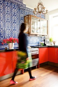
This fall everything available for purchase will appear to have been stained, dyed or pigmented with color. Red-reds with tropical greens, deep ocean blues, magenta purples and hazardous yellows; colors that are deep and full of interest. While this might seem like a typical fall trend, readily available in our post-recession economy, color has most recently been paired with large amounts of white and given the supporting role.
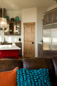
That will change and color will be king featuring colors that are opposite each other on the color wheel; called complimentary colors. You’ll see two and three colors used together in one room. A few retailers have already dubbed this trend as, “bohemian,” or “tropical,” and those words fit well. In between all that color, you’ll see hand embroidered details, textured surfaces and wicker. Yes, wicker…inside the home; right next to gold and antique brass light fixtures.
We’ve already seen front doors become colorful on the exterior; on the interior you’ll see bright, patterned wallpapers make a comeback, bedspreads will be bold and have a handmade look. Navy, gravel-toned gray and woodsy browns will be the earthy supporting colors for a vibrant and exciting fall palette. Buckle your seat belts; it’s going to be a wild fall!
-Holly Bayer, ASID